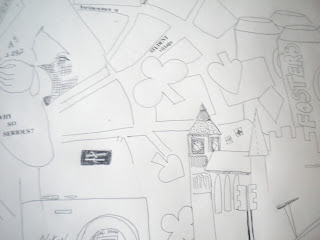
Just wanted a look...... Different was that colour can move and change, and how the boxes are laid out using fine lines.
Monday, 30 April 2012
Inspiration/Zoe Beck- Laura Paterson
Browsing through different designers on the internet I came across Zoe
Beck's work, she creates city inspired prints on to maps using vibrant
colours. I like how they look busy and chaotic.
More ideas-Laura Paterson
There are always grotty looking posters around Cities which seem to be half torn off grafittied walls, i love the contrast this creates between textures and colours. I like to collage things and work in to them creating layers and texture. I have recently started to print which is going well so far, i feel that i need to focus on how i can translate layers and texture on to fabric. I want to embroider on top of my prints and maybe add sequins and beads. I am alsothinking about using bondaweb. I will post some pictures of my prints soon.
Saturday, 28 April 2012
Alix Dessain- Artist Research
I have been looking at artists and designers to inspire my
work and help to visualise my ideas on a larger scale. I have been thinking more about creating a
wall or a room divider, as the space is open plan to be able to divide it up
with a temporary structure could prove useful. From my drawings, I think that my ideas could be translated
well to create a wall.
These 3D wall dividers by Mike and Maaike remind me of my original drawings using the coloured masking tape, but they also remind me of lines found on maps, in particular the Manchester tram map. I like how it is not all one solid block and that you can see through it as well as the combination of colours.
This piece by Sally England which could be describe as both a wall divider or a blind stood out to me. Like the piece above, I like the transparency of it as well as the texture created by the knotting of the fabric.
This textured surface by Yvette Hawkins is a interesting take on folding a map, it has made me think about the different ways in which paper and fabric can be manipulated and folded to create a interesting surface.
Movie Making- Samiyah, Fahima, Laura and Alix
Here is the final video from the moving image workshop that
we did last week. Samiyah, Fahima, Laura
and I shot this video in the weave room, and it was then edited. Although it is basic, it gave us a idea for what we could do for our final digital outcome and the chance to get ti grips with using the camera.
Alix Dessain-My work....
Thursday, 26 April 2012
Inspiration- Laura Paterson
I have recently came across this designers blog and her work has really inspired me to draw. I like the contrast of colour with the black and white drawings and i think it makes the drawings instantly more eyecatching and interesting.
More Drawings- Laura Paterson
I have been doing some quick sketches of architecture around Manchester which i thought would be nice to use in print. I like the idea of layering things and using flock and foil.
Design sheets and ideas- Laura Paterson
I have recenttly started these design sheets to get my ideas flowing, they are quirky and messy which is what I want to portray. I plan to go in to the print workshop soon and start making some chaotic prints. I want to combine numbers and text with digital print and my own drawings. I am also thinking about embroidering on top of the prints to add texture. I kind of like the idea of things being very jumbled up and messy as it creates 'chaos'.
Wednesday, 25 April 2012
Aline Johnson - Hannah Grainger
I'm
still unsure about what I want to produce at the end of my project so
I'm going to keep researching designers that look at light and
reflection to give me insperation and hopefully be inspired! I came
accross a glass designer called Aline Johnson. Really like how she over
laps the fabric and the colour palate she uses on her lights.
Tord Boontje - Hannah Grainger
Still looking at light and reflection and came across an interior designer called Tord Boontje. His work is very decorative and intrigues me as to how he creates such gorgeous work. This piece in particular caught my attention as I love how he uses paper which is something so simple yet so affective when light is added.
Samiyah Fiaz- Research Daniel Buren / Lission Gallery
Daniel
Buren -Lission Gallery
Daniel Buren uses a lot of
* Light
* Colour
* Reflection
* Mirrors
* Natural light
* Shapes
Daniel Buren uses a lot of
* Light
* Colour
* Reflection
* Mirrors
* Natural light
* Shapes
I edited digitally a photograph which I had taken in Berlin, Germany last year.
“The Holocaust Memorial”... Is just basic concrete
columns that have been repeated for miles creating a statuses'
field. I know the history behind the holocaust but why the
greyness?... WHY CANT THERE BE COLOUR? We pay respects that there was deaths
there but we can also look at the lives that were there together.“ The Holocaust Memorial”...
Is just basic concrete columns that have been repeated for miles creating a
statuses' field. I know the history
behind the holocaust but why the greyness?... WHY CANT THERE BE COLOUR? We pay
respects that there was deaths there but we can also look at the lives that
were there together.
Samiyah Fiaz- Around Manchester
Around Manchester looking at surroundings around MMU
-Looking at light, colour, architectural structures and textures
~
-Looking at light, colour, architectural structures and textures
~
Subscribe to:
Comments (Atom)


