Image 2:public transport is a huge part of the city, everywhere you look there are buses, taxi bikes and trains etc. I started to think about what people did to pass the time whilst on public transport which is why i have put a crossword on it- again relating back to letters and text. I also liked the idea of markmaking taking inspiration from the lines which divide lanes in the road and traffic lights etc.
Image 3: Every city has homeless people in it and i wanted to
bring this in to my project as i feel that they are often overlooked. I like the contrast between the grubby looking man and his dog in comparisson with the bold, bright architecture. I have layered gouache on top of coloured pencils to create the beaming light.
 Image 4: I have used lettreset on graph paper to create a background which i could work on to. I like the idea of business men and numbers, computers and technology going a bit mad. The playing cards relate to business men as they are always taking risks with money and i have combined it with a pop star and a yellow cab to create chaos.
Image 5: I really like the idea of combining maps with images and text, I also enjoyed markmaking and creating pattern making this design sheet. I wanted to make it wacky and quirky adding images of celebrities. I have used a variety of medias such as pen, felt tip, tettresset's and collage.
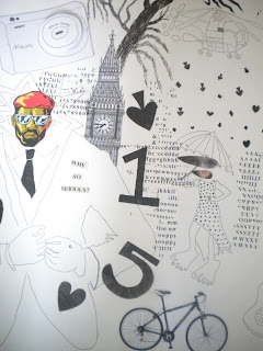
Image 6: This image is jumbled up chaos, exactly what i want to portray in my work. From architecture to people, technology, public transport, numbers and text. I want to add more to this piece of work as i move forward with my project as i don't think there should be any blank spaces.


No comments:
Post a Comment